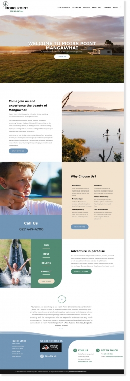
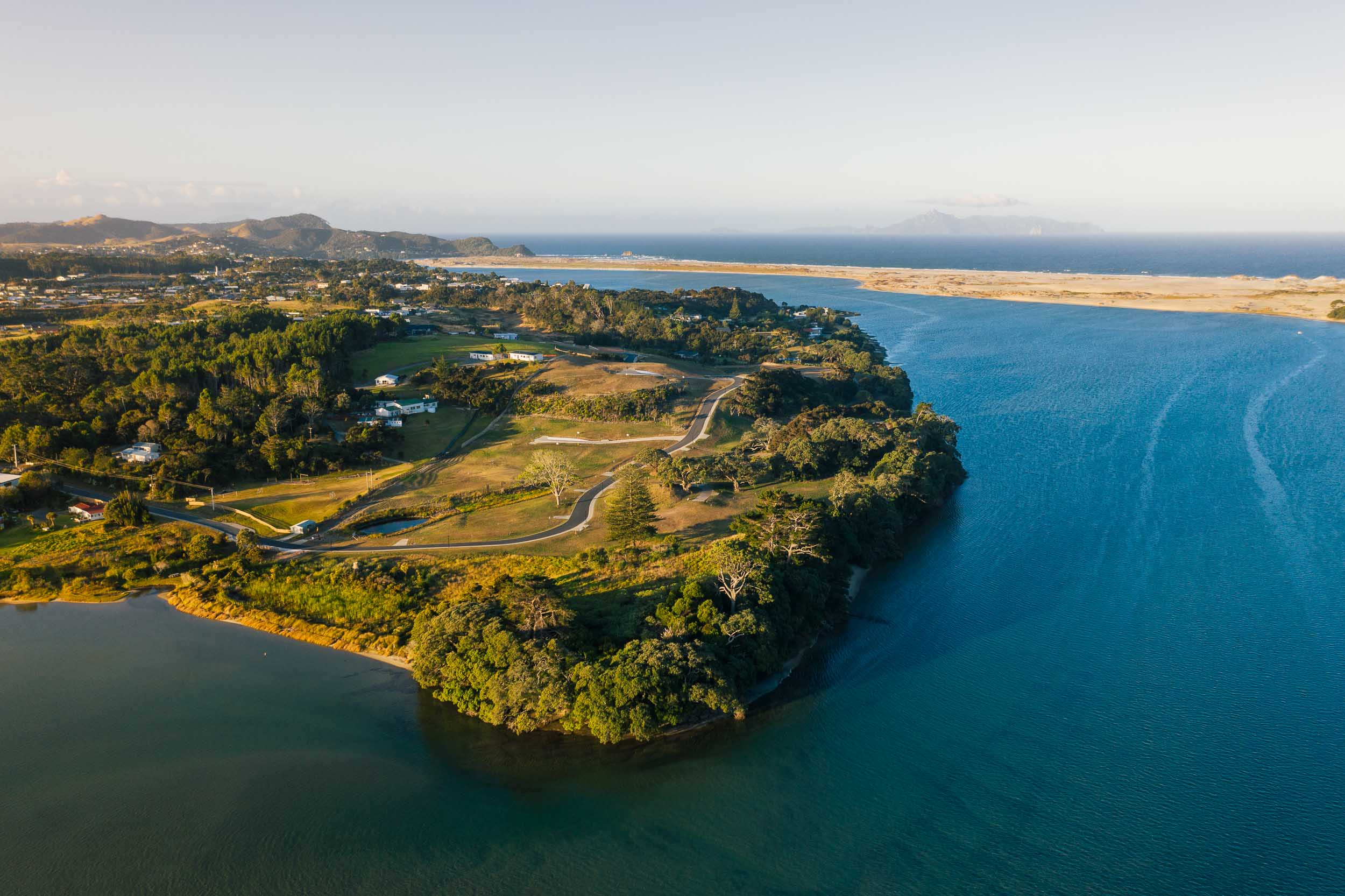
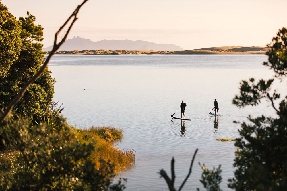
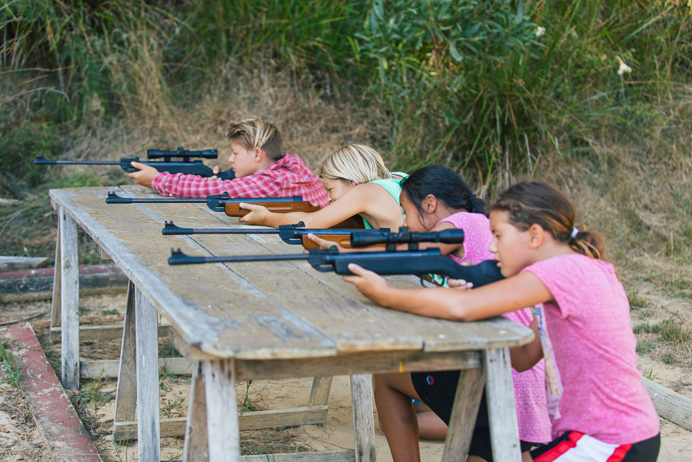
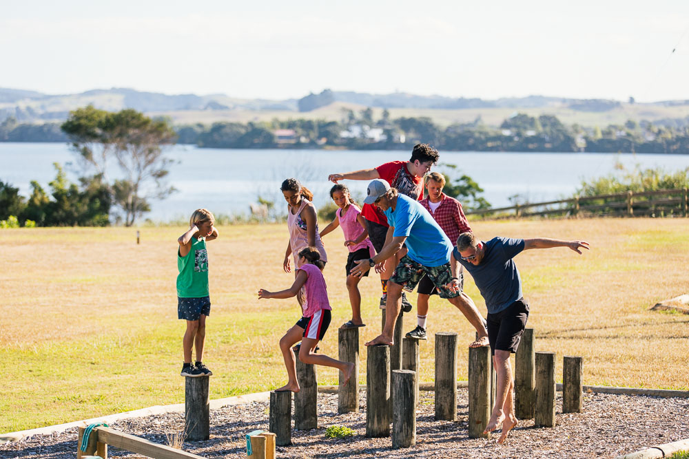
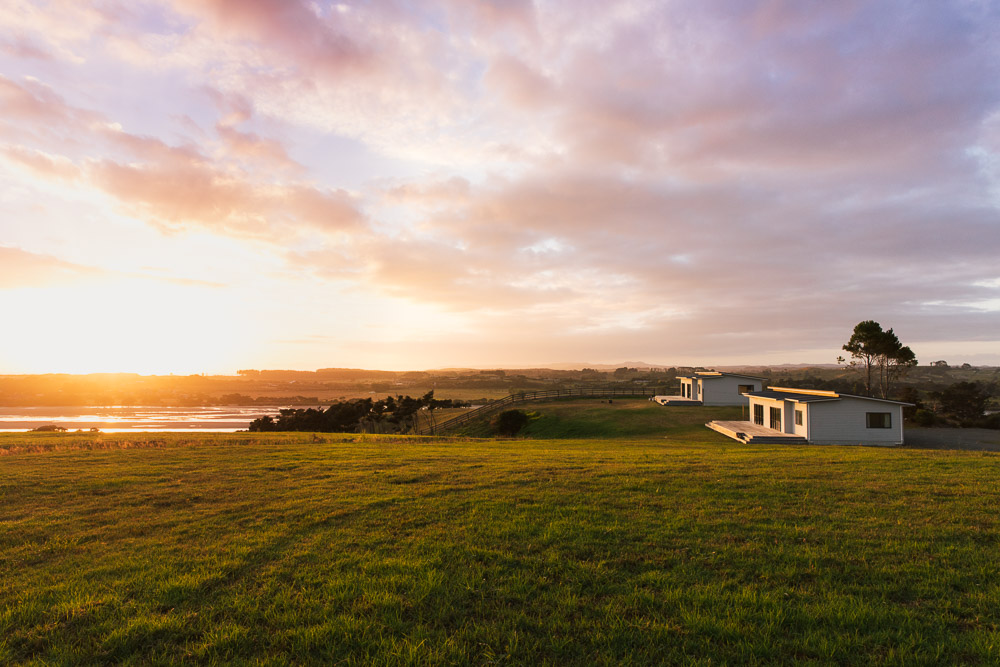
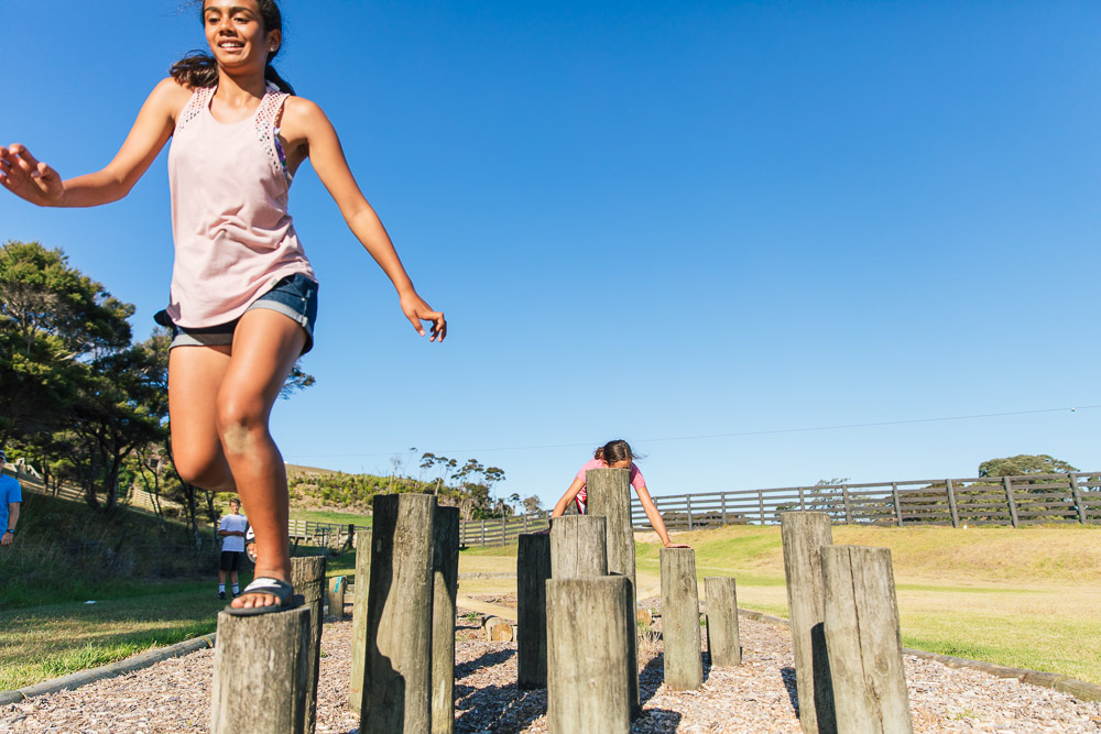
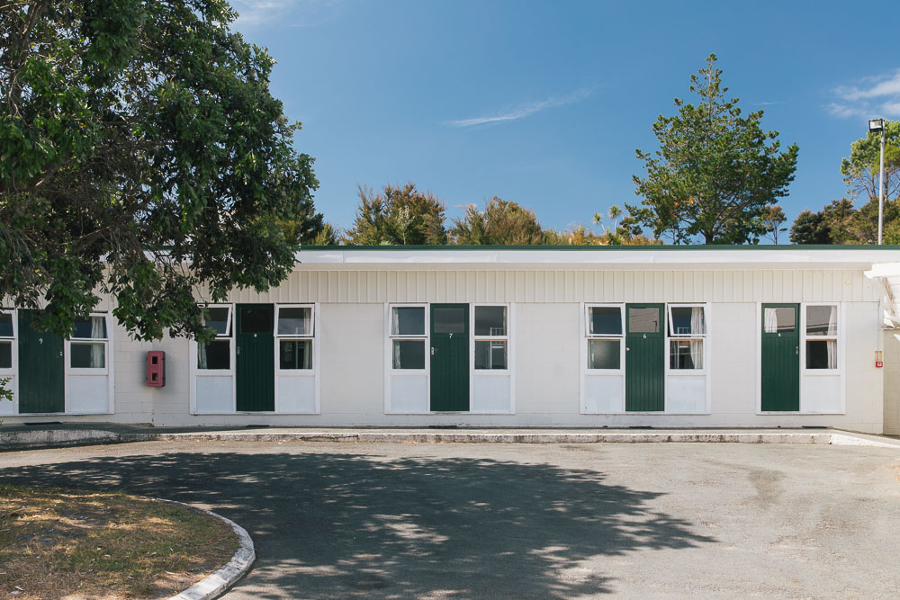
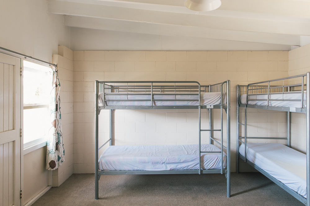
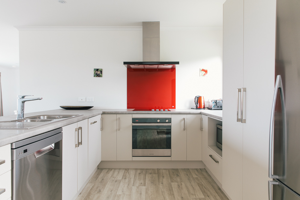
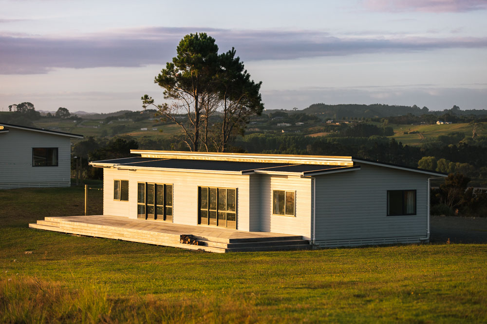
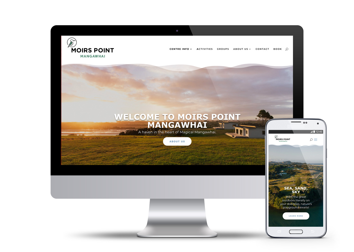
Moirs Point Mangawhai is a local favourite accomodation spot, and features in the camp stories of people from all over NZ. They were keen on a fresh new look logo and website, and to communicate to their audience that what was on offer had expanded and improved ten-fold. We were excited to take this legendary place into the future and give them a look they could be proud of and build upon moving forward. The logo design, inspired by one of the prominent visitors to the camp – the kōtare (kingfisher) – gave Moirs Point a new visual identity, along with new colours based on the surrounding natural environment: Forest, Sea, Sand and Sky. We created a new body of photographs for the website and social media, showing some of the amazing modern accomodation on offer, and showcasing the huge range of activities Moirs Point can facilitate. We were spoilt with the amazing views at the location, and got to enjoy some time on the water too! Their booking enquiry form was easily integrated, and the website has the flexibility to be grown and changed for future needs. We can recommend this beautiful place as being top quality accommodation for groups – it’s really special!
ClientMoirs Point MangawhaiServicesLogo Design and Branding, Art Direction, Site Photography, Website design & buildYear2019Linkhttp://www.moirspointmangawhai.co.nz/